TilersForums Logo Competition

UK Tiling Forum; Established 2006

Welcome to the UK Tiling Forum by TilersForums.com, built in 2006 by Tilers, run by Tilers.

View all of the UK tiling forum threads, questions and discussions here.

Tilers Forums Official Sponsors

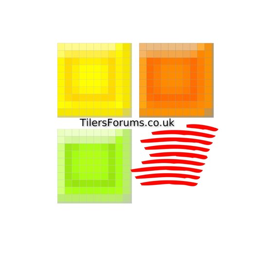
Just a couple more while I had some spare time, would be nice for some input from those that matter 😉 on what direction we should be moving towards, there have been some great entries so far, a lot of variation, a lot of comments on the trowel and sticky, is that what we should be looking at or something completely different ?

TIA

Anywho.........................
 

Attachments

  • tf1.jpg
    tf1.jpg
    170.2 KB · Views: 61
  • tf2.JPG
    tf2.JPG
    197.2 KB · Views: 66
  • tf3.jpg
    tf3.jpg
    235.5 KB · Views: 60
  • tf4.jpg
    tf4.jpg
    129.8 KB · Views: 62
  • tf5.jpg
    tf5.jpg
    151.7 KB · Views: 68
Just a couple more while I had some spare time, would be nice for some input from those that matter 😉 on what direction we should be moving towards, there have been some great entries so far, a lot of variation, a lot of comments on the trowel and sticky, is that what we should be looking at or something completely different ?

TIA

Anywho.........................

Some proper decent ones there mate. I like the first best I think, and the green on (4th?). Though it's up to the members in the end. I think if anything we'd need easier to read font style as our average age is like 47 and the eyes get weaker with age apparently 😛
 
Here's an idea very simple.

again i wanted to put the txt on the wall on the angle but cant do that on paint.
 
Hillhead and Shane - do you have Windows Publisher on your PC? That is what I used... hope this helps? I can't open Prem's...
 
A few in my head, will get around to it soon :thumbsup: still no end date ? or is there a design in mind 😉
 
On a practical note
I have been through this re-branding process a few times before professionally, so if I may offer?

I think it would be very useful to set all the logo concepts at the same scale, on the same background and number them. Then you can make a fair comparison and consider how suitable and attractive they are for the site context. Which ones work and stand out - and which ones don't.

One point to consider is that all good logos (including all the global brands) work in black as well as colour. Because at some point you might need to photocopy, embroider, stamp, etch or screenprint the logo in a single colour, maybe very small - and still recognise it. The simplest are often the best.

A gallery would rekindle interest in the competition and attract more ideas from new people too. There might be some good ones that are nearly there, but just need an obvious tweak to make them better. Once they are all in, you could close entries and take a poll...

Free beer tomorrow?
A small incentive/prize would get this project a lot more attention and response too. After all it takes time, knowledge and goodwill to design and produce good work. Some have already spent a long time on their ideas, but it helps others to justify the effort. Just an idea.

Then when someone up there has judged and you have a winner, the logo may need to be professionally created ready for web, email, and anything else you might need (printed etc). The chosen concept will probably get tidied up at this point.

Best of luck!
 
and to think, Buzz sent me this Logo via a pm this morning, and if I hadn't suggested he put it in the Logo competition, you lot would never have seen it :lol:
 
Thanks for the comments and let me know if i can be of help to any of you with banners or logos :smilewinkgrin:
 
I like it and a black background can look great on screen, allowing reflection effects too. But I thought we were just asked for logos to work directly on this existing green background. Does this change the brief now?

If this forum could be changed from green to black background, Buzzsaw's logo would look really good, ideally with a full width black background. But otherwise you would have to float the logo in a squared-off black block on the green, which won't look quite so iPod.

(It may not matter for this exercise, but yes subtle shading on black is very difficult to reproduce via other print purposes like embroidering and screen printing).
 

Advertisement

Thread Information

Title
TilersForums Logo Competition
Prefix
N/A
Forum
UK Tiling Forum
Start date
Last reply date
Replies
138

Advertisement

UK Tiling Forum

Thread statistics

Created
Dan,
Last reply from
Mistore,
Replies
138
Views
21,204

Thread statistics

Created
Dan,
Last reply from
Mistore,
Replies
138
Views
21,204
Back