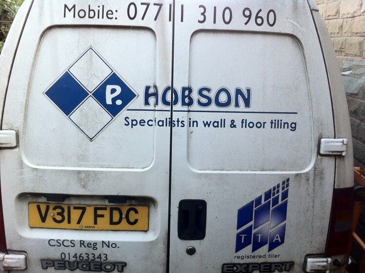
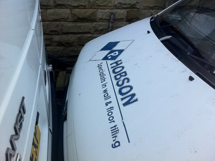
van sign writing

Tilers Forums Official Sponsors

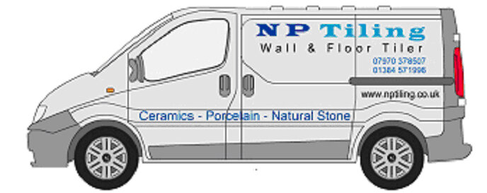
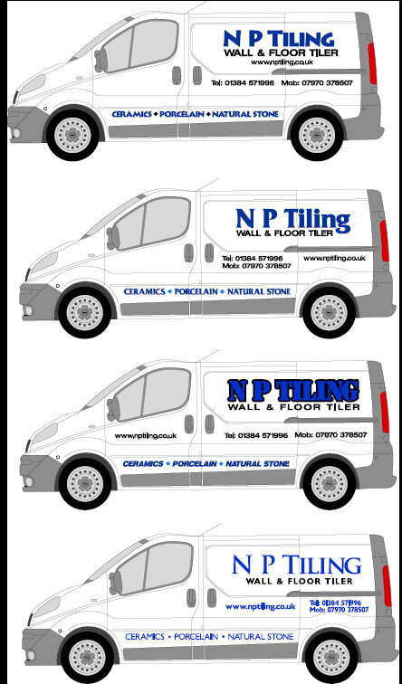
Quite like the 2nd one down out of the 4. Didn't realise it was a PDF so couldn't view it on Tapatalk
 
np van.jpg
np van 4.jpg
 
i prefer the top/1st image
much more balanced and your eyes are drawn to the key areas quickly - ie name, service and contact details

2nd choice would be number 2..
 
Top one is better , spacing/location of info is good.

Keep clear and not clumped together. Easier to read as driving around town etc.
 
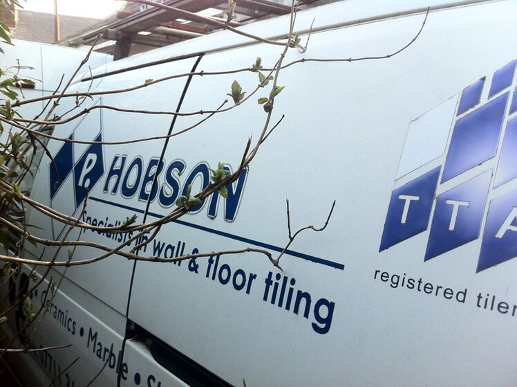
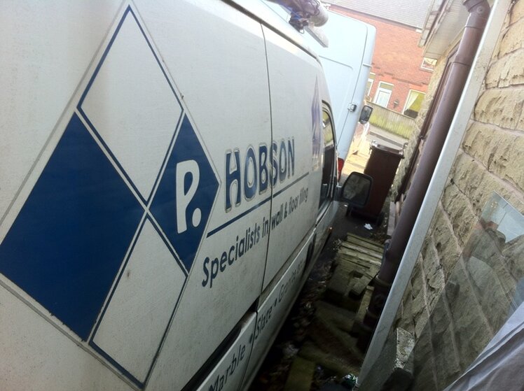
I like the top one too Neal, a bit like my old van, I have got to decide on the Transit now. Don't want to hi-jack the thead but any thoughts on mine would be welcome.
 

Attachments

  • vs1.jpg
    vs1.jpg
    199.7 KB · Views: 56
  • vs2.jpg
    vs2.jpg
    178.4 KB · Views: 56
  • vs3.jpg
    vs3.jpg
    217 KB · Views: 55
  • vs4.jpg
    vs4.jpg
    154.2 KB · Views: 55
Try playing about here for ideas Ford Transit swb & mwb vehicle graphics & decals
 
Last edited by a moderator:

Advertisement

Thread Information

Title
van sign writing
Prefix
N/A
Forum
Canada Tile Advice
Start date
Last reply date
Replies
14

Thread Tags

Advertisement

UK Tiling Forum

Thread statistics

Created
Gazzer,
Last reply from
Gazzer,
Replies
14
Views
1,181

Thread statistics

Created
Gazzer,
Last reply from
Gazzer,
Replies
14
Views
1,181
Back